Embedded vs Pop-Up Subscription Forms: Which One Works Best?

Cover image for an article with the comparison of subscription forms: embedded form vs pop-up form
19 May, 2025 • ... • 1 views
Valeriia Klymenko
by Valeriia Klymenko

Getting people to subscribe to your email list isn’t just about what you offer — it’s also about how you invite them. The design and placement of your subscription form can make a big difference in how many visitors actually sign up.

In this article, we’ll discuss the embedded form vs pop-up form differences and explore both types. We’ll also help you understand which one is best suited to your goals and share best practices for using both.

Understanding the two types of subscription forms

As email marketers, we know that growing a high-quality subscriber list is one of the most effective ways to build long-term success. Asking people to subscribe to receiving your content is a big part of the email marketing strategy — it’s the first step to building a relationship with your audience and encouraging them to return when you reach out with regular, meaningful communication.

There are two main subscription forms marketers use in 2025 — these are pop-up forms and embedded forms. Each one works a little differently, and both have their own strengths and challenges.

What is a pop-up form?

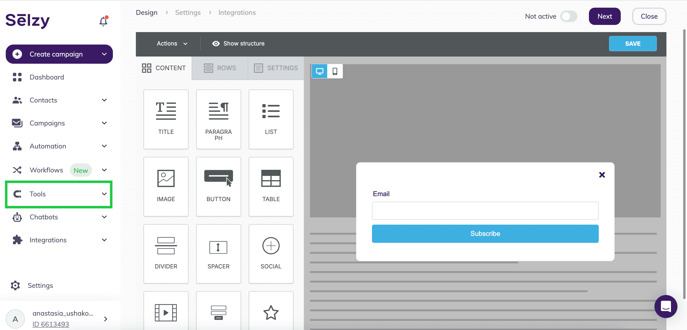
Imagine you’re browsing a clothing website, when all of a sudden a window pops up, asking you to subscribe, and maybe even offering a little discount for doing so. This is basically what a pop-up form is. 

Pop-ups appear on a webpage based on the user’s behavior. They are not displayed on the website permanently but show up at a specific moment. This could be a visitor scrolling down the page, spending a certain number of seconds on the website, or moving their mouse toward the exit button. 

For example, here’s a pop-up form on a clothing website, Lazy Oaf, triggered by me scrolling down their home page:

A pop-up form on the Lazy Oaf website featuring a 10% discount for subscribing
Source: Lazy Oaf

Pop-up forms are designed to grab attention quickly and encourage users to take the desired action as they interrupt people’s browsing experience. When used thoughtfully, pop-up forms can be an effective tool for growing your email list. But if they’re too aggressive or poorly timed, they can also annoy your website visitors.

What is an embedded form?

An embedded form is a subscription form that’s built directly into the page layout. Unlike pop-ups, embedded forms are always visible. Instead of disrupting the user’s browsing experience, embedded forms sit quietly within the content. Most often, you can find them in sidebars, footers, or between sections of a webpage.

Here’s an example of an embedded form on jewelry brand Missoma’s website — located at the very bottom of their website homepage:

An embedded subscription form on the Missoma website offering a 10% discount for signing up
Source: Missoma

Embedded forms feel less intrusive because they’re part of the webpage itself. Visitors can notice them naturally as they scroll and choose to sign up when they’re ready. If your brand prioritizes a smooth, uninterrupted user experience, embedded forms can be a better choice, as they don’t interrupt the visitor’s journey and appear naturally when the user is ready. Since embedded forms rely on users noticing them, they call for strong design, clear messaging, and strategic placement.

Here’s how form creation looks in Selzy’s builder:
First, click on Tools, and then Subscription forms.

Selzy platform interface displaying the email subscription form builder with a sample pop-up form and design tools on the left panel
Source: Selzy

Fill the fields in, and your form is ready to go!

Selzy email form builder featuring a pop-up with gold jewelry and a newsletter sign-up offer for 10% off.
Source: Selzy

Pop-up forms: High-impact but disruptive

So, pop-ups are great at capturing the user’s attention and getting quick results. They’re hard to miss, which can often lead to higher sign-up rates. But they’re not a perfect tool — that same attention-grabbing quality can also work against you. Let’s explore both sides of the approach.

Why pop-ups convert well (data & examples)

Pop-ups work well because they break up the usual flow, grabbing attention just at the right moment. Don’t just take our word for it — there’s plenty of data on the effectiveness of pop-ups. According to research by WisePops, on average, pop-ups convert 4.65% of website visitors — an increase from 4.01% in 2024. 

Want to boost the conversion rates of your pop-ups even more? WisePops suggests adding an image — pop-ups with an image have a conversion rate of 5.46%, while those without only convert 3.22% of visitors. Unsurprisingly, offering a discount is another effective way of boosting these conversions.

Here are some more examples of well-performing pop-ups:

Different kinds of pop-up forms — cart abandonment, lucky wheels, feedback, seasonal offer, and Facebook messenger, from most to least effective
Source: Optimonk

Downsides of using pop-up forms

Pop-ups can effectively boost email signups, but they come with a couple of downsides. Here are some potential drawbacks to be aware of:

  • Too much disruption. Sometimes, users are frustrated when pop-ups interrupt their browsing experience. This happens when a pop-up arrives too early, too often, or at a sensitive moment. Even if the user is interested, an ill-timed pop-up can make them click away.
  • Optimization problems. Not all pop-ups are automatically optimized for all devices. This means that on mobile, some of them can become clunky windows that are hard to close. As you can imagine, this is really annoying for users and can also lead to penalties from Google. It warns that pages with pop-ups that block mobile content can be pushed down in search results, making it harder for users to even find your website. Here are a few examples of pop-ups that are not optimized for mobile:
Different types of mobile optimization problems for pop-up forms, including non-adaptive forms, pop-ups designed for desktop, and non-clickable close buttons
Source: Insider
  • Increased website bounce rates. If a pop-up appears too soon or feels too aggressive, visitors might leave the page without engaging, a behavior known as website bounce rate. It doesn’t just mean that you lost a potential subscriber, but it can also hurt your site’s SEO over time.
  • Compliance issues. If you’re using your pop-ups to collect personal data, they’ll be subject to laws like GDPR. Failing to comply with these (like not including consent checkboxes or using misleading messaging) can lead to legal trouble and huge fines.

Best practices for effective pop-ups

So, now you know what not to do when it comes to pop-up forms. We’re here to tell you what pop-up best practices you should follow to make them super effective.

  • Be thoughtful of timing. Don’t just throw a pop-up at a visitor as soon as they land on your page; give them time to engage with the website first. According to Optimonk, the perfect timing can be anywhere from 20 seconds to a minute, but it all depends on the nature of your brand and customer journey.
  • Make a valuable offer. We know this works from the stats we discussed earlier in this article — offering discounts creates a huge incentive for the users to sign up. Other perks you can offer include free guides, early access, or exclusive tips.
  • Use clear wording. The text of your pop-ups should be short, direct, and action-oriented. Try to focus on the benefits your user will get (like “Get 10% off!”).
  • Use purposeful design. We already know that pop-ups with images are more effective than those without. So, use strong visuals but don’t clutter — the pop-up should still be easy to understand at a glance. 
  • Limit frequency. Nobody wants to be swarmed with five pop-ups the moment they log on to a website. Set rules so that each user only sees a pop-up once per session.
  • Test regularly. As an email marketer, you already know everything about A/B testing. But did you know you can apply it to pop-ups, too? Testing different designs, timings, and offers can reveal what resonates with your audience. According to Wisepops, A/B testing can increase clicks for your pop-ups by at least 5%.

Embedded forms: Consistency over aggressiveness

Unlike pop-ups, embedded forms don’t jump out or interrupt the visitor’s experience. Commonly found at the end of blog posts, in sidebars, or on marketing landing pages, they sit on your website naturally and are simply part of the flow. 

While they don’t grab the user’s attention as forcefully as a pop-up, they provide consistency — which is something just as important. 

Embedded forms are built right into the design of a landing page, either using custom layouts or tools such as page builders. These platforms make it easy to create clean, well-placed forms that blend naturally into the user’s journey. We have a guide on the best landing page builders to help you make an informed choice when it comes to designing your landing page.

Advantages of embedded subscription forms

Let’s check out some of the upsides of using embedded subscription forms:

  • Non-intrusive experience. Embedded forms don’t annoy your website’s visitors by interrupting the flow. They’re part of the page layout, letting people choose to engage when they feel ready.
  • Better for SEO performance. Because embedded forms don’t disrupt the page layout, users tend to stay longer and engage more — factors that may have a small yet measurable impact on SEO.
  • Consistent visibility. An embedded form is always there, waiting to be seen. This steady presence means that even if a visitor isn’t ready to subscribe immediately, the option is always there.
  • Trust-building. Since embedded forms aren’t aggressive, they can make your brand feel more trustworthy. With embedded forms, your visitors don’t feel pressured.

Limitations of embedded forms

Now let’s examine the potential downsides of embedded forms:

  • Lower immediate visibility. Since these forms are built into the layout of your website, some users might not notice them right away or miss them entirely.
  • Potentially slower conversions. Embedded forms rely on users being motivated enough to scroll, read, and decide to subscribe. If your visitors are particularly impatient, you might miss out on capturing them.
  • Good page design required. If you needed a sign to reexamine your landing page design, this is it. Bad design can hurt your chances of getting signups. This includes poorly organized pages or random and buried form placements.
  • Less flexibility for targeted offers. Unlike pop-ups, which can be triggered based on user behavior, embedded forms are static. This means you may miss out on an opportunity to present a personalized offer to a customer who’s about to exit the page, for example.

Best practices for embedded forms

Now that we’ve covered the advantages and disadvantages, let’s dive into some embedded forms tips and tricks:

  • Place wisely. Add your embedded forms to places that correspond with users’ higher engagement and motivation to take action. For example, near the bottom of blog posts, after product descriptions, or alongside valuable content. Another potential location for your form — above the fold (meaning visible without scroll).
  • Make it noticeable. Once you’ve chosen a strategic location for your form, make it eye-catching. Use clear headings and simple but noticeable design elements.
  • Keep it short. The fewer fields you ask the user to fill out, the better your chances of getting a signup. Unless you have a particular reason to ask for more info, stick to just their name and email address. However, this doesn’t mean you don’t need to include a link to your privacy policy!
  • Offer incentives. This is something we discussed in the pop-up form section — offering discounts for signing up is a great way to attract more people. Even if you’re not offering anything like that, keep your language action-oriented and clear. 
  • Match the design. Since your embedded form is a part of your website, its design should match the rest of your page. Use the same fonts, colors, and tone for a smooth user experience.

Pop-up vs embedded forms: Which one should you use?

As you can see, both pop-up and embedded forms have their strengths and weaknesses. The best choice depends on your goals, your audience, and how you want people to experience your website. Let’s figure out together what each option is best suited for.

When to use pop-ups for maximum impact

Pop-ups are a great tool when you need quick results. For example, if you’re running a limited-time offer, hosting a flash sale, or promoting a special event. These are the situations when a well-timed pop-up can help you grab attention and drive action fast.

A flash sale pop-up form featuring a 50% discount coupon
Source: OptinMonster

Pop-ups are also useful when your main goal is to build your email list quickly if you’re just starting out, for example. Pair it with a strong incentive, like a discount, a free download, or exclusive content. The key to using pop-ups successfully is offering clear value: if visitors immediately see what’s in it for them, they’re much more likely to respond positively. And don’t forget about good timing — pop-ups triggered by behavior tend to perform better.

When embedded forms are the better choice

Choose embedded forms when you want to prioritize a smooth, low-pressure user experience. These are perfect for businesses focused on building trust, nurturing long-term relationships, or offering high-value content that speaks for itself. 

For example, Fendi, as a luxury brand, doesn’t need to entice website visitors with flash sales or limited-time offers, so it makes sense that it would use an embedded form over a pop-up.

An embedded subscription form on the Fendi website
Source: Fendi

Embedded forms also work well when your audience needs time to engage, like reading a blog post, browsing a product page, or exploring your services. Here’s an example from the newsletter platform Substack. Here, the embedded form appears at the bottom of The Molehill blog, so the visitor can choose to subscribe once they’re done reading:

An embedded subscription form on Substack
Source: Substack / The Molehill

Lastly, embedded forms can be a good fit for you if you want to maintain a clean, professional website design.

Can you use both? Finding the right balance

Can you get the best of both worlds by combining pop-ups and embedded forms? We believe that you don’t have to choose, and a mixed approach can help you achieve the best results. 

This is what British clothing brand Damson Madder does. Their pop-up form, triggered by scrolling, features strong visual imagery:

A pop-up form on the Damson Madder website featuring a 10% discount for signing up and a picture of a woman
Source: Damson Madder

If you scroll to the bottom of their website, you’ll see the embedded subscription form featuring a simple design that matches the rest of the page:

An embedded form on the Damson Madder website offering 10% for signing up
Source: Damson Madder

A pop-up can help you capture the attention of visitors who are ready to take action, while an embedded form can offer a more subtle option for those who prefer to engage at their own pace (it can also be helpful to those who closed the pop-up by accident). 

Done thoughtfully, combining both strategies can help you reach different types of users without overwhelming your audience.

Conclusion: Choosing the best form for your goals

And that’s everything you need to know about pop-up and embedded subscription forms! Choosing the right marketing strategy can make a big difference in growing your email list, regardless of whether you’re aiming for a few quick sign-ups through pop-ups or building long-term trust with an embedded form. Be mindful of your timing, your design, and your audience, and let your forms turn visitors into loyal subscribers!

19 May, 2025
Article by
Valeriia Klymenko
With an over 10-year background in building win-win relations with clients and 6-year background in increasing the customer loyalty through email marketing, Valeriia is a true adept of implementing all the new tools and practices leading to the business success. Her passion lies in finding a secret key to each heart and secret ingredient to each strategy leading to the desired goals. Valeriia enjoys cosulting all kinds of businesses on how to make the most with the email channel, become a sender subscribers wait campaigns from, and see all the benefits of the email marketing proven by its outstanding ROI.
Visit Valeriia's
Latest Articles
Selzy Selzy Selzy Selzy
OSZAR »